 Connect
Webydo Website Builder Guide
Introduction
Webydo provides an intuitive website builder with a variety of features that lets you build any kind of website. It also provides a lot of unique fine-tuning capabilities not found on other builders. One downside is the high cost and lack of a free plan. However, you are free to use a 7-day trial in order to determine whether or not this service is the plan for you.
Webydo offers four different plans.
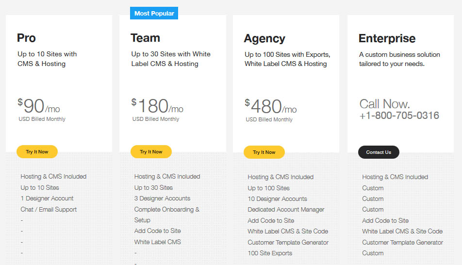
Figure 1: Webydo Plans
The Pro plan is $90 per month, or a discounted $900 annually. This provides hosting, up to ten different websites, one designer account, and chat/email support. The Team plan is $180 per month, or a discounted $1,800 annually. This lets you create up to 30 sites, up to 3 designer accounts, setup, and the ability to add coding to your site. The agency plan is $480 a month, or a discounted $5,760 annually. This lets you create up to 100 sites, 10 designer accounts, a dedicated account manager, a custom template generator, and up to 100 site exports. Finally, you can create an Enterprise business plan, where you have a custom number of sites and designer accounts and site exports, which is priced depending upon what you need.
Once you’ve decided on the plan that works best for you, it’s time to create your own website!
Getting Started
Before getting started, it’s important to note that later on, you will be informed that the website builder works best on Google Chrome or Safari web browsers, so be sure to start out this process while using one of these. Head on over to webydo.com to start your free trial. You can either view built example websites with “view designs”, a structured website build with “view wireframes”, or from scratch using “start crafting.”
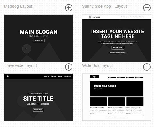
Figure 2: Example of wireframes
Either of the three choices will bring you to the same editor page, so choosing one of these options simply depends on how much customisation you wish to customise your page.
Editor
When you open the site editor, you’ll notice a Photoshop like configuration that provides a large number of options.
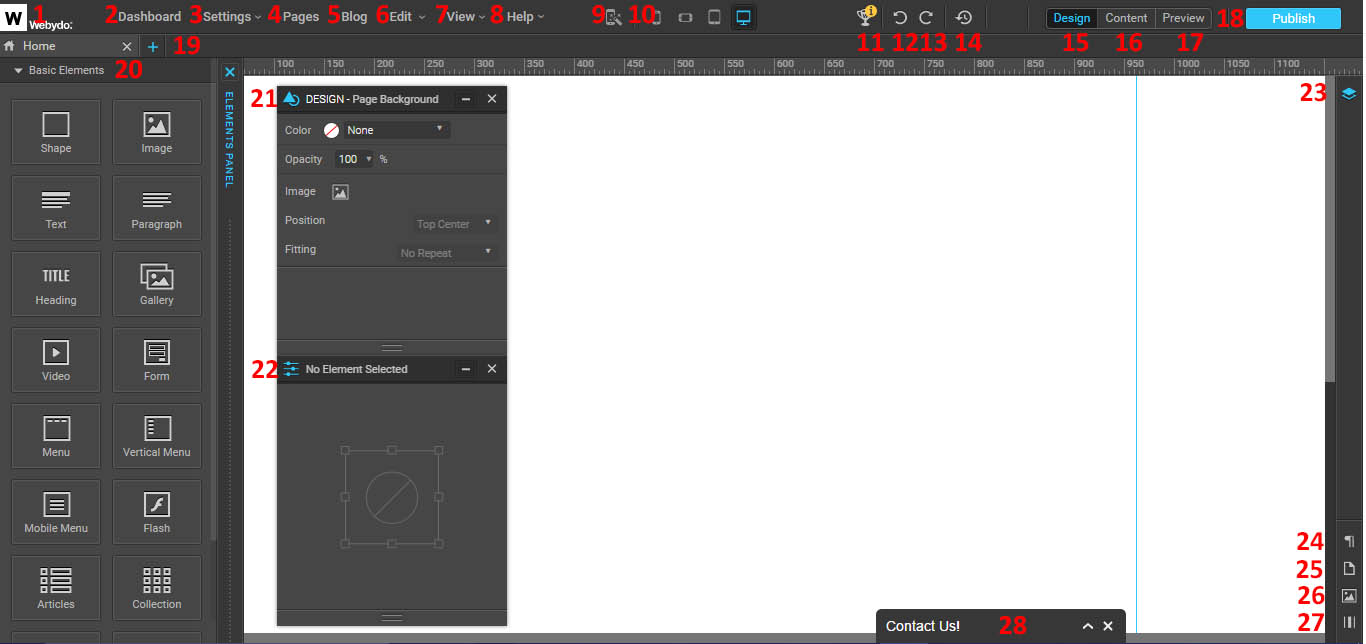
Figure 3: Webydo Editor
- Go back to the Webydo dashboard.
- Also takes you back to the Webydo dashboard.
- View settings for your website.
- Brings up the Pages & Navigation menu.
- Brings up blogging for your site.
- Editor menu.
- Change the editor view.
- View help features.
- Brings up the automatic layout tool.
- Activate different views (mobile, mobile landscape, tablet, and desktop).
- Brings up the Webydo tutorial.
- Undo last change.
- Redo last change.
- View the history of revisions from your website.
- Design view.
- Content view.
- Preview view.
- Publish your site.
- Brings up the Pages & Navigation menu.
- View elements you can drag onto your web page.
- View the design tab for whatever element or feature you have selected.
- View the properties tab for whatever element or feature you have selected.
- Bring up the different layers of your site.
- Bring up the paragraph styles menu.
- Bring up the Pages & Navigation menu.
- Bring up the media library.
- Overlay a grid on your site.
Elements
Basic Elements
Shape
This lets you insert a shape onto your page. You are given squares with which you can increase or decrease different dimensions of that shape. You can also change these properties with the design and properties tabs.
Design
- Determine the x and y position of the shape on your page.
- Set the width and height of your shape.
- Set the shape to automatically fill to the full width and/or full height of your page.
- Decide if the shape appears in front of or behind other elements on your page.
- Decide the fill colour.
- Decide if the fill is a solid colour, none, or gradient.
- Determine the fill’s opacity.
- Add a background image to the shape. If you add an image, you can remove it with the trashcan that appears.
- Choose the image’s size (original, stretched, fill, or fit).
- Choose the position of the image in the shape.
- Choose if the image is repeated within the shape (as horizontal, vertical, or patterned).
- Choose if the image scrolls with the page.
- Choose if the outline of your shape is solid, dashed, or dotted.
- Choose the outline colour.
- Choose the stroke size of the outline. You can also make this different for different sides of your image.
- Modify the corner radius of each corner. This allows you to create rounded corners on your shape, in case you want a circle or oval instead of a square or rectangle.
- Choose if you have an outer or inner shadow.
- Choose the colour of the shadow.
- Choose the opacity of the shadow.
- Choose the horizontal distance of the shadow.
- Choose the vertical distance of the shadow.
- Choose the spread of the shadow.
- Choose the size of the shadow.
- Choose if this shape links anywhere (to a page, URL, or anchor).
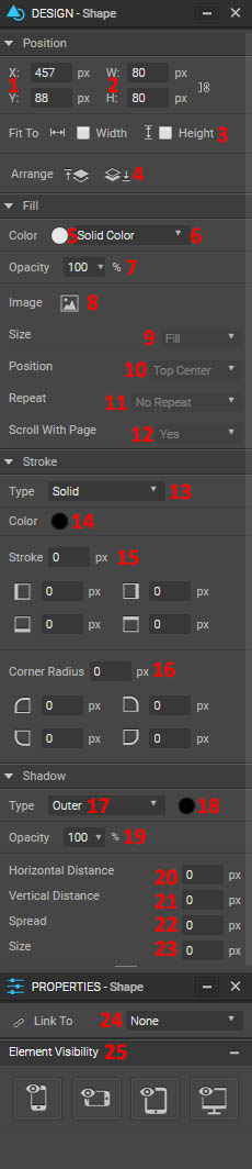
Figure 4: Shape editor menu
- Determine the element’s visibility on different platforms (phone, landscape phone, tablet, and/or desktop).
Image
This lets you add an image to your webpage. Again, you can drag the edges of the image using the squares that appear to change the images size, or you could modify it using the design menu. Because you can add an image to a shape and make it essentially the same as an image item, the design options for image are identical to those of shape.
Properties
- Upload or change your image.
- Reset your image to its original properties.
- Make your image appear larger in its box using “Zoom.” Drag the image around to determine which part of your larger image is in your frame.
- Change the image’s title, which appears when you hover over the image.
- Change the image’s alt text, which appears when the image won’t load.
- Choose if the image links to another page, URL, or anchor.
- Choose if the image has a text caption (which you can modify by clicking on it once it appears).
- Choose if the image is non-editable by CMS.
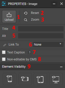
Figure 5: Image Properties
- Modify the element’s visibility on different devices.
Text
This allows you to add a header and paragraph item to your page at once. To edit the text, double click within the element and it will bring up the text editor. So for modifying this area, you can change the text editor, the design editor, and the properties editor.
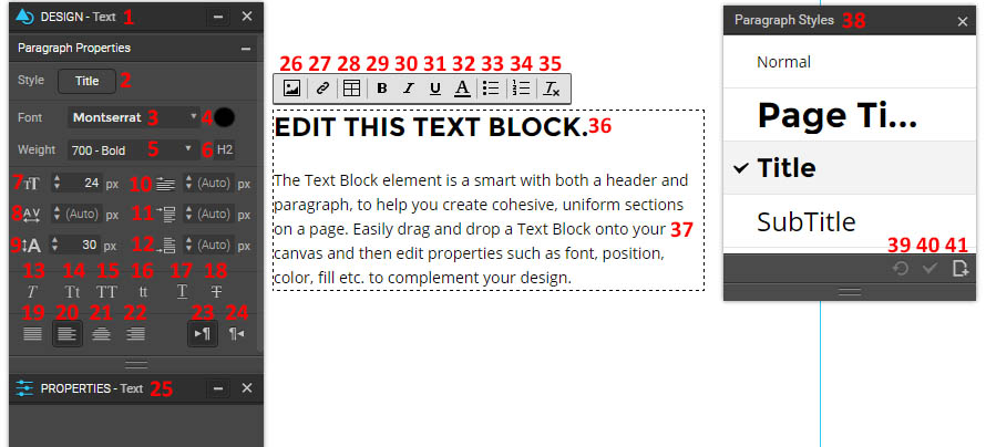
Figure 6: Text Element
- Design menu. When you click on the perimeter of the text block, this menu changes to the same design menu for shape.
- Bring up or close the paragraph styles menu.
- Change the paragraph’s font.
- Change the font’s colour.
- Change the font’s weight (ranges from thin to ultra-bold).
- Displays the heading type for that segment of text.
- Change font size.
- Change letter spacing.
- Change line height.
- Change the number of pixels in the text indent.
- Change the margin top size.
- Change the margin bottom size.
- Italicize the highlighted text.
- Change the first character of each word to uppercase for the highlighted text.
- Change the highlighted text to all caps.
- Change the highlighted text to all lowercase.
- Underline the highlighted text.
- Strikethrough the highlighted text.
- Justify text.
- Align text left.
- Align text centre.
- Align text right.
- Have the paragraph flow left to right.
- Have the paragraph flow right to left.
- The properties menu of the text. When you click on the perimeter of the text block, you can add padding to the text box. You can also change if it is editable by CMS, and its visibility on various devices.
- Insert an image.
- Insert a link.
- Insert a table.
- Bold the selected text.
- Italicize the selected text.
- Underline the selected text.
- Change the font colour.
- Create a bulleted list.
- Create a numbered list.
- Clear all formatting.
- Edit the header text.
- Edit the paragraph text.
- This is the Paragraph Styles menu. From here, you can change the paragraph formatting. Default options are: normal, page title, title, subtitle, gallery title, and gallery description.
- Clear any override you’ve made to the paragraph’s style.
- Save any changes you’ve made to the paragraph’s style.
- Save the current paragraph style as a new style, or create a new style of your own. You can choose to make it classified as paragraph or a heading 1-6.
Paragraph
Insert a paragraph element to the page. Because this is the same as the text element without the heading, the options are the same as the text editor menu.
Heading
Insert a heading element to the page. Because this is the same as the text element without the paragraph, the options are the same as the text editor menu.
Gallery
This allows you to display several photos at once. The design elements are the same as with the shapes and images. To change the gallery properties, click once on the gallery element. You will have the option to manage your gallery, where you can rearrange the image order, delete images, delete all images, or upload more images. You can also decide whether or not a text caption is present, whether or not arrows are available for website visitors to switch between pages, whether or not the gallery is editable by CMS, and the visibility on different devices.
If you click on the gallery again, you can change the properties for individual gallery items. You can choose the image transition (no animation, fade in, slide horizontally, or slide vertically), as well as its duration in seconds. You can decide if the gallery autoplays, and the delay for this upon loading of the page.
Video
This allows you to insert a video onto your page. The design features are the same as that for image and shapes. Properties lets you input a YouTube or Vimeo URL of a video. You can also change the video title, which defaults to the title located for the video at that URL. You can also decide if the video is on autoplay, on a loop, if the controls are hidden from the website visitor, and if the video is non-editable by CMS. You can also change the element’s visibility on different devices.
Form
This allows you to insert a form onto your page. This can be used to send you a message, sign up for an emailing list, enter a contest, and more. The design feature comes with all of the typical elements. The properties feature is how you edit your form. You can also edit individual elements once you’ve inserted them by clicking on them within the form. To get back to your overall form properties, click on the background of your form.
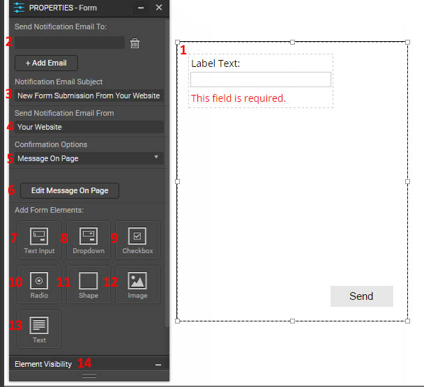
Figure 7: Form Properties Menu
- The form display.
- Decide who gets the notification when someone fills out this form. Use add email to confirm, or the trash can to delete the entry.
- The subject of the email to you when you get a new submission.
- Where the notification email comes from.
- How the user knows they successfully filled out the form.
- Brings you to the confirmation message so you can edit it. Clicking on it will bring up the text properties menu. You can also add shapes, images, and text to the area.
- Add a text input field. Click on the label text to edit it. Clicking on the white block will allow you to edit the text input field’s properties menu. You can change the direction, type (single, multi-line, or password), validation (making sure the user has properly inserted what you want; can be email, number, date, or phone), font, font colour and size, field space, predefined text (text that already appears in the white bar before the user inputs any), and whether or not it is required. You can also toggle the error text, to see what the user will see if they don’t input a value even though the area is required.
- Add a dropdown menu. Clicking on the white bar and viewing properties lets you change the menu direction, change the items in the menu as well as their label and the opportunity to add more, the font, the font colour and size, the list space, whether or not the field is required, and what the title of the dropdown menu is. You can also toggle the error message on and off for yourself.
- Add a checkbox or checkboxes. You can change the menu direction, whether they are displayed horizontally or vertically, change the items in the checkboxes as well as their label and the opportunity to add more, the font, the font colour and size, the checkbox space pixel size, the padding, and whether or not it is a required field. You can also toggle on and off the error message.
- Add radio buttons. You can change the menu direction, whether they are displayed horizontally or vertically, change the items in the radio buttons as well as their label and the opportunity to add more, the font, the font colour and size, the radio space, the padding, and whether or not it is a required field. You can also toggle on and off the error message.
- Add a shape to your form.
- Add an image to your form.
- Add a text field to your form.
- Change the form’s visibility on different devices.
Menu
This allows you to create a horizontal navigation menu on your page. If you click on the perimeter of the menu, you’ll get the typical design menu that will apply to the entire menu, and a unique property menu for the menu. You can choose “manage menu” to get the pages and navigation menu, which will let you change things like the link order and name appearance. You can also choose the direction the links appear (left to right or right to left), if the tab length is set or dynamic (changes according to the text length), and if it is non-editable by CMS. You can also change the menu’s visibility on different devices.
If you click on one of the individual tabs of your menu, you’ll get a new design menu:
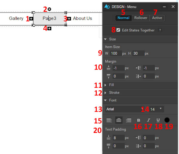
Figure 8: Menu Design Options
- Add a menu item to the left.
- Remove this item from the menu.
- Add a menu item to the right.
- Add a submenu item to this.
- Change how the menu items appear under normal conditions.
- Change how the menu items appear when a user rolls over the.
- Change how the menu items appear when a user clicks on them.
- Edit the three above states at the same time, if you want them to all appear the same.
- Change the size and height of the menu items in pixels.
- Change the margins of the menu items.
- Change the fill properties of the items. It has the same options as the previously shown “Fill” options.
- Change the stroke option of the items (the outside border). It has the same options as previously shown.
- Change the font of the labels in this menu.
- Change the font size of the labels in this menu.
- Change the alignment of the labels in this menu.
- Bold the font of the labels in this menu.
- Italicize the font of the labels in this menu.
- Underline the font of the labels in this menu.
- Change the font colour of the labels in this menu.
- Change the text padding for the labels in this menu.
Vertical Menu
Create a menu that runs down the page instead of across it. The design options are exactly the same as that for the horizontal menu.
Mobile Menu
Create the type of menu that is optimised for a mobile device. It also adds a button to your page with three horizontal lines that can be clicked on to bring up your menu, which also has a standard set of design and property options. Ideally, you would have a normal menu appear on your page for non-mobile devices, and the mobile menu only appear for mobile sites.
Flash
Add a flash item to your page. You need to upload the flash file for this to do anything. It has the standard design options. The property options allow you to upload your file, change the title of the file, choose if it is editable by CMS, and choose the element’s visibility.
Articles
This allows you to add a collection of articles to your page. The default article format includes the title, date, byline, teaser text, picture, and read more link. If you click on the perimeter of the articles unit, you’ll get the options for the entire articles display. The design page has the standard options. For properties:
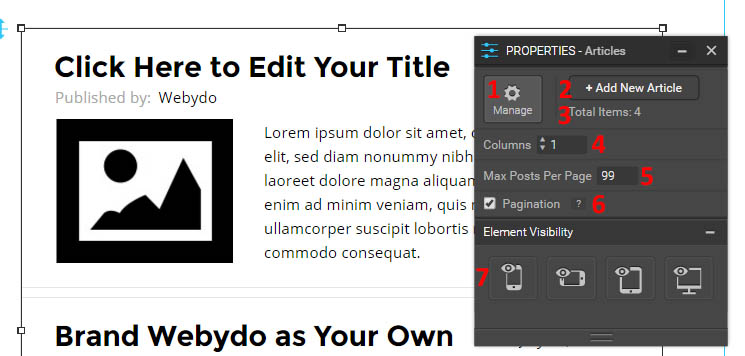
Figure 9: Articles Properties Menu
- Manage your articles. You can add a new article, you can rearrange the order of the articles, or delete already added articles.
- Another way to add a new article.
- Displays the total number of articles this unit currently has.
- Change the number of columns.
- Choose a maximum number of posts per page.
- Choose whether or not the page number is displayed on the bottom of your article unit (if you have multiple pages).
- Change the visibility of this item on different platforms.
If you click in the white space of an article, you’ll get the options for that specific unit. You will get the same design options, and in the properties menu you can add different elements to your article unit. You can add a shape, image, title, text, or video. If you add an element to one, you’ll add it to all of your article elements. You can also change the name of the current article unit you have selected, and you can change the element’s visibility. If you want to change any of the elements of your articles, you can also click on any of the added items and view their design and properties menus.
Collection
This allows you to add a collection of products to your page. The default format is picture, name, and product number in a grid layout. The overall options are identical to that for the articles element.
HTML
This allows you to add code to your page. If you view the properties menu, you can paste in the code of interest in the “code” box. You can also change its visibility, or use the design menu to change the finished results’ appearance with the standard tools.
Iframe
Add an Iframe to your site. This lets you to embed another HTML page within your current page. Add it by going to the properties menu and inputting the URL for the webpage you wish to embed. Change the appearance with the design tab.
Blog
For these to work, you have to “Start a Blog”.
Vertical Feed
This inputs a vertical feed of all of your blog posts onto your page. This means that you will have your picture, date, title, and description all on separate lines. The design options are the standard ones. The properties menu is specific to blog feeds, and has a variety of options.
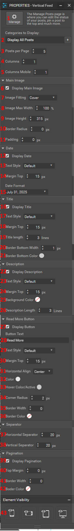
Figure 10: Feed Properties Menu
- Takes you to the manage posts page for your blog. This will be discussed in more detail when we discuss blogging.
- Choose if you want to display all posts, or only posts of a certain category. You can also choose to add a new category here.
- Choose the number of posts you want to display per page.
- Choose the number of columns you want to use to display your blog posts.
- Choose how many columns you want the blog posts to display with on mobile devices.
- Choose whether or not to display the main image.
- Choose how to fit your main image. You can choose between “cover”, “contain”, and “original size”.
- Choose the image’s maximum width as a percentage of its original size.
- Choose the image’s height in pixels.
- Choose the border radius (which rounds the image’s corners).
- Choose the padding for the image.
- Choose whether or not to display the date on your blog post.
- Choose the text style for your date. You can pick: normal, page title, title, subtitle, gallery title, and gallery description. The settings for these are determined by your “Paragraph Styles” page mentioned previously.
- Choose the top margin above your date.
- Choose the date format. Several permutations are available.
- Choose whether or not to display the title on your blog post.
- Choose the text style (same options as for date).
- Choose the top margin above your title.
- Choose the maximum number of lines in which to display your title. It will cut off after that many lines.
- Choose the bottom border width (the line that appears below your title).
- Choose the colour for this border.
- Choose whether or not to display your description.
- Choose the text style for your description (same options as for date).
- Choose the top margin for the description.
- Choose the background colour for the description.
- Choose the maximum number of lines in which to display your description. It will cut off after that many lines.
- Choose whether or not to display a “read more” button.
- Choose what the read more button says.
- Choose the text style for the button’s text (same options as for date).
- Change the top margin for the button.
- Choose how to align the button. You can align it to the left, right, or centre.
- Choose the button’s colour.
- Choose the colour of the button when it is hovered over or clicked on.
- Choose the corner radius (to round the button)
- Choose the border width for your button.
- Choose the border colour for your button.
- Modify the horizontal space between blog posts.
- Modify the vertical space between blog posts.
- Choose whether or not to display the page number, if your feed has multiple pages.
- Choose the pagination’s top margin.
- Choose the pagination’s border width.
- Choose the pagination’s colour.
- Choose the feed’s visibility on different devices.
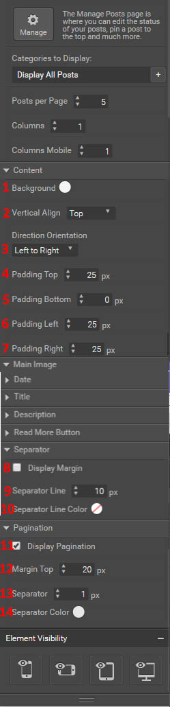
Figure 11: Horizontal feed options
Horizontal Feed
This inputs a horizontal feed of your blog posts onto your page. This means that your picture will display at left, and your date, title, and description will be on the right of it. The design menu is the standard. Most of the properties are the same except for the inability to change margins or have borders. The differences are highlighted at left. Note that you can only have one feed per page.
- Change the content background.
- Change the vertical alignment. Choose between top, centre, and bottom.
- Choose the direction orientation (left to right or right to left). Basically, you can choose if the picture is displayed to the left or right, as well as the text alignment, which will be towards the picture.
- Choose the top padding for the content.
- Choose the bottom padding for the content.
- Choose the left padding for the content.
- Choose the right padding for the content.
- Choose whether or not to display a separator margin between posts.
- Choose the line thickness for the separator.
- Choose the line colour for the separator.
- Choose whether or not to display the pagination.
- Choose the top margin for the pagination.
- Choose the separator width for the pagination.
- Choose the separator colour for the pagination.
Vertical Feed (side by side)
This feed option lets you display the posts with each element in an individual line, but display each one next to each other. The options are the same as the normal vertical feed.
Horizontal Feed (with circular pictures)
This feed option lets you display your horizontal posts with a circular photo instead of a square. The options are the same as the normal horizontal feed.
Horizontal Feed (with columns)
This feed option lets you display the posts where everything is displayed to the right of the main photo like in the horizontal feed, but also display each post side by side. The options are the same as the normal horizontal feed.
Recent Posts
This feed option lets you display just the picture with the title and date to the right, without any description or read more button (they are unchecked by default). The options are the same as that for the normal horizontal feed.
Galleries
Full Width
This allows you to create a photo gallery where each picture is the full width of the gallery. The design options are standard.
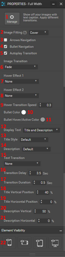
Figure 12: Gallery properties
- Manage your gallery images. You can drag the around to change their order. You can also add images or delete them. If you click on an image, you can delete it with the trashcan in the image’s corner, or at right you can replace the image with the “Replace image” button. At right, you can also change the title and description of each image in your gallery, as well as what the picture links to (a page, URL, anchor, or popup of that image).
- Choose how the image is fit (cover or contain).
- Choose if arrows are on the gallery for the user to be able to navigate voluntarily between pictures.
- Choose if bullets are present at the bottom for the user to navigate voluntarily between pictures.
- Choose if the gallery autoplays between pictures.
- Choose what the image transition looks like (fade, zoom in front, zoom in back, slide vertical, slide horizontal, bounce vertical, or bounce horizontal).
- Choose a hover effect. Choose between zoom in, zoom out, slide, rotate & zoom out, focus, blur, grayscale, grayscaleout, sepia, sepiaout, and opacity.
- Choose another hover effect to work in conjunction with the previous. The options are the same.
- Choose how long after hovering it takes for the effects to occur.
- Choose the bullet colour.
- Choose the hover/clicked on colour of the bullets.
- Choose the display text (title and/or description, or none).
- Choose the title style (determined by your paragraph styles).
- Choose the description style (same options as above).
- Choose the text transition (for the title and description of each image). Choose between move horizontal or vertical, clip from different directions, and zoom.
- Choose the text transition delay.
- Choose the text transition duration.
- Choose the title’s vertical position.
- Choose the title’s horizontal position.
- Choose the description’s vertical position.
- Choose the description’s horizontal position.
- Choose the gallery’s visibility on different devices.
Hover Effects
This lets you choose a way to display photos that involves lines, white space, and nice typography. The design effects are standard. The properties lets you really manage your image in a visually appealing way.
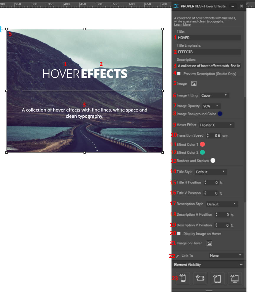
Figure 13: Hover effects properties
- Title text.
- Emphasis text.
- Description text.
- Choose whether or not to preview the description.
- Choose the image for this element.
- Choose if the element fills for cover, contain, or original size.
- Choose the image opacity.
- Choose the image background colour.
- Choose from a wide variety of hover effects. This will change how the image appears when someone hovers their cursor over it.
- Choose the transition speed when someone hovers over the picture.
- Choose colour 1 for the hover effect.
- Choose colour 2 for the hover effect.
- Chose the colour of the border and line strokes.
- Choose the title style (determined by paragraph styles).
- Choose the title’s horizontal positioning.
- Choose the title’s vertical positioning.
- Choose the description style (determined by paragraph styles).
- Choose the description’s horizontal positioning.
- Choose the description’s vertical positioning.
- Choose if a different image is displayed upon hover.
- Choose what that image is.
- Choose if the image links to anywhere.
- Choose the element’s visibility on different devices.
Fluid Grid
Create a fluid grid of images on your web page. The designs page is standard for this.
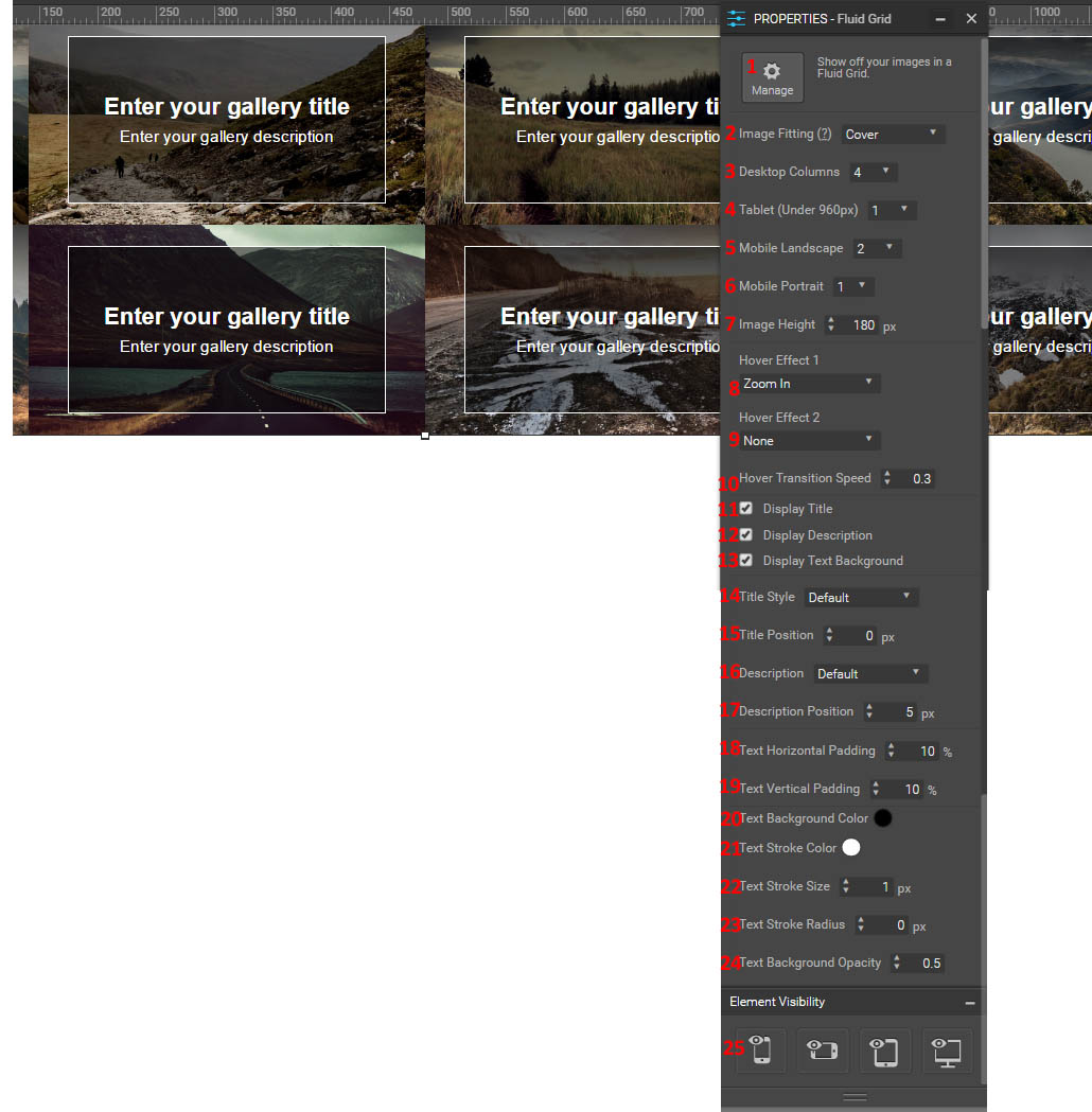
Figure 14: Fluid gallery properties
- Manage your gallery. This brings up the same options that it did for the full-width gallery.
- Choose the image fitting options within its container space. Choose between cover, contain, stretch, original size, fit to height, or fit to width.
- Choose the number of columns that appear when the website is viewed on a desktop.
- Choose the number of columns that appear when the website is viewed on a tablet.
- Choose the number of columns that appear when the website is viewed on a mobile device in landscape mode.
- Choose the number of columns that appear when the website is viewed on a mobile device in portrait mode.
- Choose the image height in pixels.
- Choose the hover effect. You can choose between zoom in, zoom out, slide, rotate & zoom out, blur, focus, grayscale, grayscale out, sepia, sepia out, flash, opacity, and shine.
- Choose a second hover effect that acts in conjunction with the first one.
- Choose the hover effect transition speed.
- Choose whether or not to display the title on your images.
- Choose whether or not to display the description on your images.
- Choose whether or not to display a text background on your images (here, it would be the -darkened outlined square).
- Choose the title style (options determined by paragraph styles).
- Choose the title position.
- Choose the description style.
- Choose the description position.
- Choose the horizontal padding for the text.
- Choose the vertical padding for the text.
- Choose the text background colour.
- Choose the text stroke colour.
- Choose the text stroke size.
- Choose the text stroke radius (if you want it rounded instead of squared)
- Choose the text background opacity.
- Choose the element’s visibility on different devices.
Fixed Grid
Add your images in a fixed grid. Instead of side by side rectangular photos, you will have squared photos with space between them. The design menu is standard, and the properties menu is very similar, with a few changes in options at the very top.
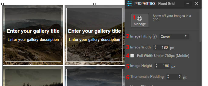
Figure 15: Properties menu for fixed grid
- Manage gallery images.
- Choose the image fitting options within its container space. Choose between cover, contain, stretch, original size, fit to height, or fit to width.
- Choose the image width.
- Choose to keep your width under 760 pixels for optimal viewing of mobile devices.
- Choose the image height.
- Choose the padding between the images.
Image Rotator
This lets you create a gallery of images that scrolls along horizontally to display them all. The design menu is standard.
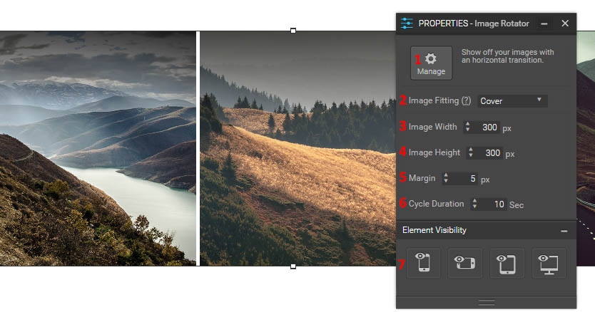
Figure 16: Image rotator properties menu
- Manage the gallery images.
- Choose the image fitting properties. Choose between cover, contain, or original size.
- Decide the images’ width.
- Decide the images’ height.
- Choose the margin between pictures.
- Choose how long it takes to cycle through one picture.
- Choose the element’s visibility on different devices.
Logo Rotator
This is similar to the image rotator, but only shows logos and defaults at a much smaller size. The only difference in options is the lack of a choice to determine the image fitting settings.
Thumbnails
This lets you create a gallery where the user can select an image to view with thumbnails at the bottom.
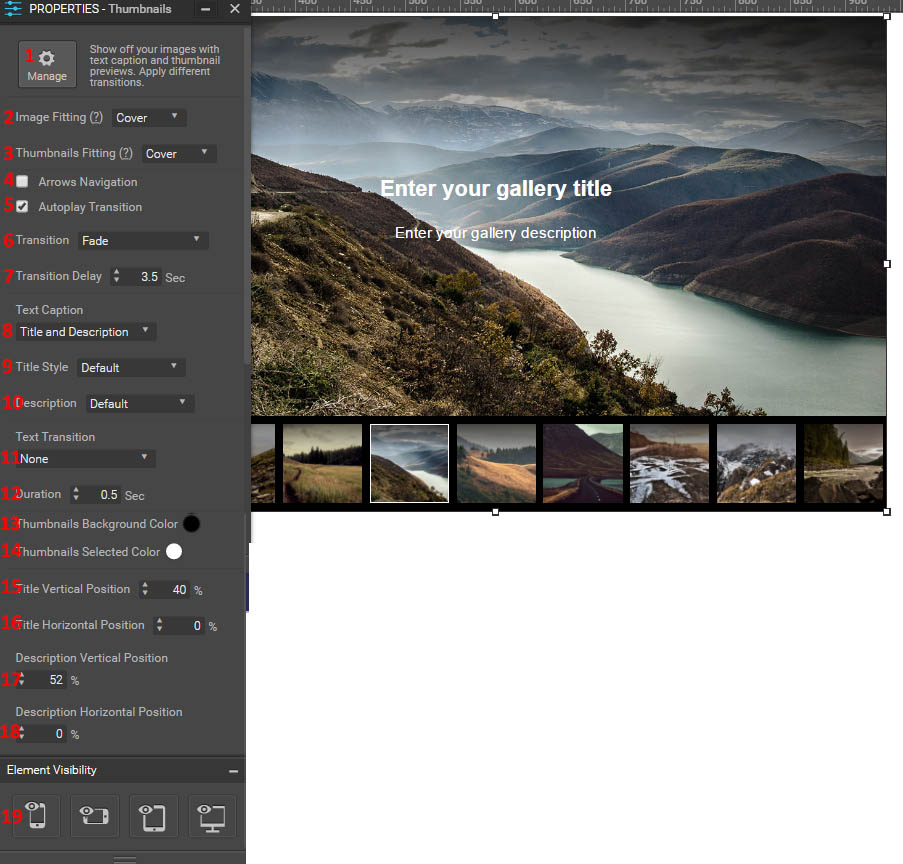
Figure 17: Thumbnails properties menu
- Manage the images in your gallery.
- Choose how the images fit in your frame. Choose between cover or contain.
- Choose how images fit in the thumbnail preview. Choose between cover or contain.
- Choose if arrows are present for navigation.
- Choose if the gallery automatically transitions between images.
- Choose the transition type between images. Choose between fade, zoom in front, zoom in back, slide vertical, slide horizontal, bounce vertical, and bounce horizontal.
- Choose how long it takes before the images transition between one another.
- Choose if the text caption over the gallery is title and/or description, or if there is none.
- Choose the title style (options determined by paragraph styles).
- Choose the description style (options determined by paragraph styles).
- Choose the text transition. It can move, clip, or zoom in a variety of directions.
- Choose the duration of the text transition.
- Choose the thumbnails background colour.
- Choose the thumbnails selected colour.
- Choose the title vertical position.
- Choose the title horizontal position.
- Choose the description vertical position.
- Choose the description horizontal position.
- Choose the visibility of this element on different devices.
Slide Show
Create a slide show of different images. It has the same properties as the “full width” gallery, but doesn’t take up the entire width of the page.
3D Parallax
This uses multiple layers in order to create a 3D image perspective effect.
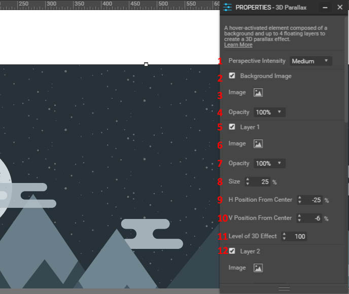
Figure 18: 3D parallax properties
- Choose how intense the perspective is for the 3D effect.
- Choose if you have a background image.
- Choose what the image is.
- Choose the image’s opacity.
- Choose if you are displaying layer 1.
- Choose layer 1’s image.
- Choose the opacity for that image.
- Choose the image’s size.
- Choose the image’s horizontal position.
- Choose the image’s vertical position.
- Choose the 3D effect’s level.
- Options 5-11 repeats for all four layers. At the bottom you can decide if this parallax links to anything, and its visibility on different platforms.
Buttons
Solid Button
This creates a solid button that you can use to link to a variety of things (URL, pages, or anchors).
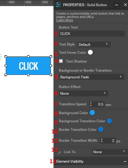
Figure 19: Button properties menu
- Choose the text on the button.
- Choose the button’s text style.
- Choose the colour of the text when it is hovered over.
- Choose if the text has a shadow.
- Choose the transition of the background or border when you hover over it. You can choose none, back pulse, bounce, fade, radial, rectangle, shutter, or sweep from different directions for the background, and fade, hollow, outline, over line, ripple, trip, and underline from different direction for the border.
- Choose the button’s effect when you click on it. You can choose bob, bounce, bubble, buzz, float, grow, hang, pop, pulse, push, shadow, shrink, sink, skew, tilt, or wobble from various directions.
- Choose the speed with which the transition takes place.
- Choose the background colour for the button.
- Choose the background colour of the button for the transition.
- Choose the border colour of the button for the transition.
- Choose the border transition width.
- Choose what the button links to.
- Choose the button’s visibility on different devices.
Ghost Button
Put a ghost button on your site. This is similar to a solid button but without the background for the button. Therefore, your properties menu will have all of the same options but background colour. You can also round out your button here with the “border radius” option. Note that the space between the text and border is clear, so anything you have behind the button will show through.
Radius Button
Put a button with rounded corners on your site. This has the same properties menu as a solid button, but with the addition of the corner radius option.
Text Button
This creates a button that only has text to click on. The only difference is the lack of an option to choose your background colour.
3D Button
This creates a button with a 3D shadow to make it appear three dimensional. The different options here are that you can change the 3D colour and the border colour and width. You also cannot choose any transitions or button effects.
Round Button
This creates a circular solid button. The options are identical to a normal solid button.
Call Solid
This is the same as the solid button, with the same options, but instead of linking to a page, it sends your phone to call a specified phone number.
Call Ghost
This is the same as the ghost button, but calls a number instead of going to a URL link.
Call Radius
This is the same as the radius button, but calls a number instead of going to a URL link.
Call Text
This is the same as the text button, but calls a number instead of going to a URL link.
Call 3D
This is the same as the 3D button, but calls a number instead of going to a URL link.
Call Round
This creates a rounded button with a phone logo that you can use to link to a phone number. Instead of having text options, since there is no text you have an icon colour, hover colour, and shadow. Other than that, all options are the same as a normal button.
Social
Facebook Like
This lets you add a Facebook “like” button to your page.
- Choose the layout (standard, horizontal with text, horizontal with counter, or vertical with counter). The text tells you to share the item, and the counter tells you how many other people have liked the counter.
- Choose light or dark colour scheme.
- Choose the button’s display language.
- Choose the button type (like or share).
- Choose if the profile pictures of people who have liked the page are shown.
- Choose if a share button is also displayed.
- Choose the button’s visibility on different platforms.
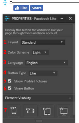
Figure 20: Like button properties menu
Facebook Share
This allows visitors to share your website on their Facebook page. You can choose a layout (standard, horizontal with counter, vertical with counter, icon only, text only, or icon and text), as well as the button’s display language. Finally, you can choose the title and description of your page that appears when it gets shared.
Twitter Tweet
This allows users to tweet your website on their Twitter account.
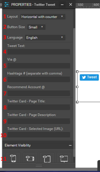
Figure 21: Twitter tweet menu
- Choose the layout for the button (standard, horizontal with counter, or vertical with counter).
- Choose the button size (small or large).
- Choose the language your button appears in.
- Choose what the default tweet text says when someone chooses to tweet about your site.
- Choose to at mention your user name or another when someone tweets about your site.
- Choose hashtags to add to the end of the post.
- Choose a recommended Twitter account for those who tweet about your page. This would ideally be your Twitter or the one you use for this website/business.
- Choose the page title for your page for when it gets shared.
- Choose the page description for your page for when it gets shared.
- Choose the image URL that appears when your page gets shared.
- Choose this element’s visibility on different deices.
Twitter Follow
Links someone to follow an account of your choice on twitter. You can choose the button size (small or large), the button language, and the username that will be followed upon clicking the link. You can also choose if the button displays the username you will be following, and if a counter of the number of followers appears. Finally, you can change the element’s visibility on different devices.
Twitter Hashtag
Have someone tweet your hashtag on their twitter page. Because it, too, will link for someone to create a Twitter post, the menu is identical to that for the “Tweet” button.
Pinterest Follow
Allow users to follow your Pinterest account. You can modify the username that gets followed with this button by using the properties menu. You can also change the button’s visibility on different devices.
Facebook Comments
Allow users to make comments on your website via their Facebook account. You can choose the element language, the color scheme (light or dark), the order (top, newest, or oldest), and the number of posts that are visible. You can also modify the element’s visibility.
Plugins
Swiftype Search
This lets visitors search your website for phrases. To implement this search bar, you need to input your Swiftype engine key. To sign up for this service (basic options are free), head to here.
Ecwid Store
This lets you display and sell products in an online store. To do so, input your Ecwid store ID. You can then customize the number of categories that appear in each row, the default product view (grid, list, or table), and the default view for search results (grid, list, or table). You can also choose the number or products per row and column if displayed as a grid, or the number of products per page if it is in a list or table format. Finally, you can modify this element’s visibility on different devices. To learn more about using Ecwid to sell your products, go to https://my.ecwid.com/cp/.
PayPal Button
This lets you add a purchase button where users can purchase products through your PayPal store. You can modify which button you choose, the product name that they are purchasing, the currency, the price, a discount (if any), a shipping cost (if any), and the tax. You will need to input either your merchant ID or your PayPal email address. To learn more about using PayPal to create a store, go to www.paypal.com.
Disqus Comment
This allows users to comment and have discussions on your webpage using Disqus. You can manage it through the “Manage” button, which links directly to the Disqus web page. You also must enter your Disqus shortname to successfully add it to your page. To learn more about Disqus, go to https://disqus.com/how/.
GetSiteControl
Using a GetSiteControl plugin, you can do things like make surveys, mailing list signups, contact forms, popups, follow buttons, share buttons, and live chats. You must use your ID to enable this. You can also choose to hide the widget from canvas. In order to manage the content that appears on your page, click on “Manage”, which will take you directly to the GetSiteControl page for content management. You can use this website to create various widgets that you can then go ahead and add to your site. To learn how to use these tools, go to https://getsitecontrol.com/howto/.
Olark Chat
Using an Olark chat plugin, you can create a field for live chatting with visitors. You can use the “manage” button to go to the Olark site and change the chat’s properties. You will need to input your Olark ID in order to use the services. You can also choose to hide the widget from the canvas. To learn more about this service, go to https://www.olark.com/features.
Tidio Chat
This is another method to create a live chat. You can modify its properties on the Tidio page by using the “manage” button. You’ll need to input the public key for your own personal chat. You can also hide the widget form the canvas. To learn more about this service, go to http://www.tidiochat.com/en/knowledge.
Wufoo Forms
This is another way to create a form on your page. You can use it for forms, surveys, or invitations. Using the “manage” button will take you to the Wufoo page to modify your widget’s properties. You’ll also need to input your username and form hash for what you wish to insert. You can also choose whether or not to show the form header. TO learn more about using Wufoo, go to http://www.wufoo.com/features/.
Compare Ninja
Use this to create tables, graphs and charts. You can manage them in the Compare Ninja website with the manage button. You’ll need to input your Ninja Table ID in order to make the widget work. To learn more about Compare Ninja, go to https://www.compareninja.com/features.
PowToons
Use this to create animated presentations. You can manage them on the PowToons page with the “manage” button. You will need to input your PowToons ID to make the presentation appear. To learn more about PowToons, go to https://www.powtoon.com/.
SimplyBook
Use this to allow people to book appointments on our website. You can manage them on the SimplyBook page with the manage button. You’ll need to input your company login. You can choose from a variety of color schemes: blank, clean slide blue, clean slide gold, directory blue, dot luv, rainbow colored dark, teal, vcard gray, and web factory wood. You can also choose if your timeline is flexible, modern, flexible weekly, or slots weekly. To learn more about SimplyBook, go to https://simplybook.me/index/we-are-fit-for.
Widgets
These are a variety of plugins provided by POWr. For each one, you can modify the widget by going to “manage” on the properties menu, or double clicking on the widget itself. All of these have some features that are only available to premium users. The types of widgets include things like FAQs, an ecommerce page, popups, social media feeds, a map, a graph, video and photo galleries, surveys, polls, forms, count-downs, hit counters, and the weather. To learn more about the different types of widgets, you can go to https://www.powr.io/plugins.
Page Background
If you don’t click on anything on your page or click on the page background, you’ll be able to view the design menu.
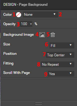
Figure 22: Page design menu
- Choose the colour for your background.
- Choose if you want no colour, solid colour, or a gradient.
- Choose the background’s opacity.
- Choose a background image.
- Delete the added background image.
- Choose the size of the image. You can choose between original size, stretched, fill, or fit.
- Choose the position of the image on the background.
- Choose if the image has a horizontal repeat, vertical repeat, pattern, or no repeat.
- Choose if the image scrolls with the page.
Pages & Navigation
To reach your pages and navigation page, you can either access it from the right-hand side of your page, or access it when you attempt to add a new page to your site.
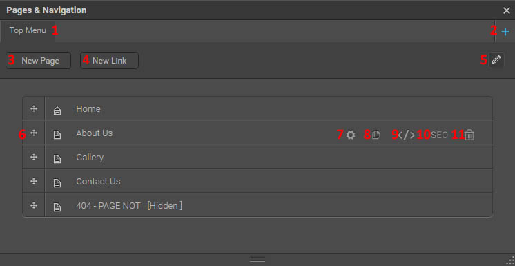
Figure 23: Pages & Navigation
- Your different menu types are displayed here.
- Add a new menu.
- Add a new page to your site.
- Add a new link to your menu. It will ask you what menu to put the link in, the name of the link, the type of link (internal, external, or anchor), and what that link is to. You can also choose whether or not the link opens in a new window.
- Edit the menu’s name.
- View the pages in your menu here. You can drag them around to rearrange them, or modify their settings at right.
- Change the page settings. On the page setup tab, you can modify the page title, URL, which menu it is included in (if any), the name in the menu, and its visibility (public, private, or password protected). You can also set it as your home page. On the SEO tab, you can modify the search engine optimisation settings. You can modify the description that appears when your site shows up on a search engine, and the keywords that are used to locate your site. There are also a variety of advanced options that should only be utilised by those familiar with how to use SEO settings.
- Create a copy of this page.
- Add code to your page. You can change coding in the header or body, as well as unique CSS. You can choose to just add it to one page or all pages. This should only be utilised by those familiar with HTML and CSS.
- Another way to get to SEO settings for that page.
- Delete this page. You cannot delete your home page.
Settings
Site Presets
This allows you to change presets for your website.
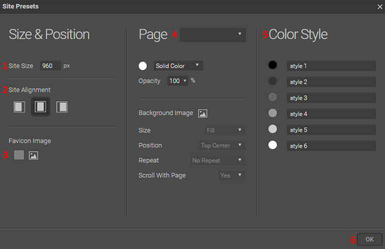
Figure 24: Site presets
- Choose the maximum size of your website.
- Choose how your site is aligned (if it’s smaller than the window the user creates).
- Choose your favicon image (appears in tabs and favourites bars next to your site name).
- Choose defaults to modify. You can change the background (modify the colour, opacity, and image along with its size, position, repeat, and scroll with page), the fill (modify the colour, opacity, and image along with its positioning and fitting), the stroke (type, colour, stroke size, and corner radius), and the shadow (colour, outer or inner, percentage, horizontal & vertical distance, spread, and size).
- Choose default colour styles for your site. You can make up to six. You can also rename them.
Interface Branding
This lets you change how your editor interface appears. You can choose to make it lighter or darker, and choose the elements that appear blue to appear a different colour.
Blog
This allows you to create and edit blog posts, as well as modify certain appearance aspects.
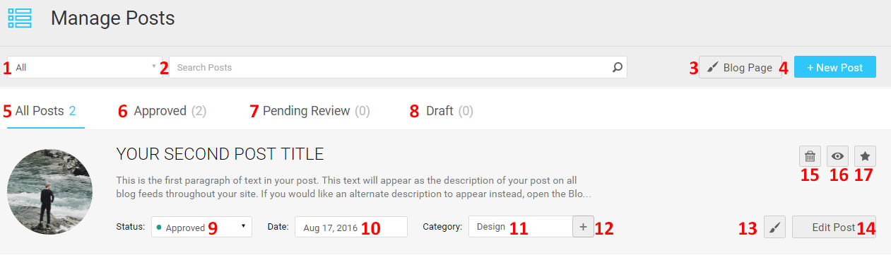
Figure 25: Main blog page
- Choose to view all blog posts, or only those in a certain category.
- Search through your posts to find a specific keyword or keywords.
- Create a new post.
- Go to your blog page.
- View all posts.
- View only approved posts.
- View posts pending review for your approval.
- View drafts.
- Change this post’s status (approved, pending review, or draft).
- Choose the posted date.
- Choose the category the post is in.
- Create a new post category.
- Enter design mode.
- Edit the post.
- Delete the post.
- Preview the blog post.
- Pin post to the top of any time your posts are displayed.
New Post/Edit Post: Content Mode
The central blog area will have the following format:
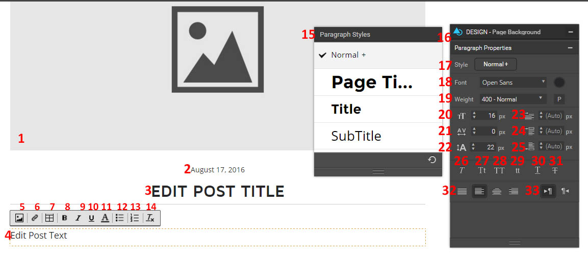
Figure 26: Blog content mode
- Main image. Use the properties menu to change the image, title, and alt text.
- The date. Use the properties menu to change the format and text style.
- Edit post title. Has the same modifiable properties as the post text.
- Edit post text. Use the above options, the paragraph styles, and the design menu to modify its appearance.
- Add an image.
- Add a link.
- Add a table.
- Bold the text.
- Italicize the text.
- Underline the text.
- Change the font colour.
- Create a bulleted list.
- Create a numbered list.
- Remove all formatting.
- Use one of the default paragraph styles.
- The design menu, which is for the post title and text.
- Choose the default style.
- Choose the font type and colour.
- Choose the weight.
- Choose the font size.
- Choose the letter spacing.
- Choose the line height.
- Set the text indent size.
- Set the top margin.
- Set the bottom margin.
- Italicize the text.
- Capitalise the first letter of each word.
- Transform all letters to upper case.
- Transform all letters to lower case.
- Underline the text.
- Strikethrough the text.
- Change the alignment.
- Change the paragraph direction.
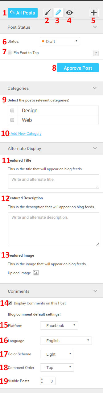
Figure 27: Blog options menu
At left, you’ll see several other blog options:
- Return to the “manage blog” page.
- Enter “design” mode.
- Enter “content” mode.
- Enter “preview” mode.
- Add a new post.
- Change the blog’s status.
- Pin post to the top of any blog feed pages.
- Approve the post for publication.
- Select the category or categories that you want your blog post to be associated with.
- Create a new post category.
- Create a featured title to use on blog feeds instead of the current title.
- Create a featured description to appear on blog feeds instead of the first paragraph of your post.
- Choose a featured image to use on blog feeds instead of the one at the top of your post.
- Choose if you want comments enabled for this post.
- Choose the default platform for blog comments (Facebook, Disqus, or none)
- Choose the comment language.
- Choose the comments colour scheme (light or dark).
- Choose the comment order (top, newest, or oldest).
- Choose the number of comments visible at a time.
New Post/Edit Post: Design Mode
This brings up your post with all elements available for placement. This allows you to make any modifications you would make to any other page on this blog post’s page.
Blog Page
This takes you to design mode (allowing you to add and remove elements and modify the design and properties of those elements) for the blog page that contains all of your posts.
Edit
There are two different edit menus. One appears at top in your toolbar, and the other appears when you right click on the page. Most of these require you to select an element before you can use them.
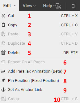
Figure 28: Top editing menu
- Cut element.
- Copy element.
- Paste element.
- Duplicate element.
- Delete element.
- Repeat this element on all pages.
- Add a parallax animation.
- Pin this item to this position (it will not scroll up as the page moves).
- Set this as an anchor link (it links the user to move down to a particular position on the web page).
- Group up several elements to be entered into one modifiable unit.
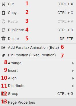
Figure 29: Second edit menu
- Cut element.
- Copy element.
- Paste element.
- Duplicate element.
- Delete element.
- Add a parallax animation.
- Pin this item to this position (it will not scroll up as the page moves).
- Sent to front or to back (in terms of layers).
- Insert an element.
- Align to left, centre, right, top, middle, or bottom on your page.
- Distribute to left, centre, right, top, middle, or bottom of your page.
- Group elements.
- Go to page properties (takes you to the pages & navigation menu).
View
This lets you change various items that can help you with designing your page.
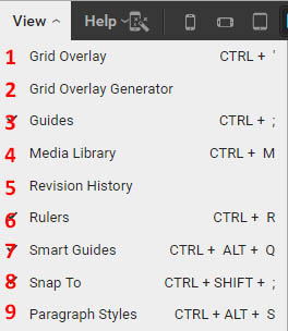
Figure 30: View menu
- Turn on/off grid overlay.
- Open grid overlay generator. Choose the number of columns, column padding, and gutter width.
- Turn on/off guides.
- Open the media library.
- Open revision history.
- Turn on/off rulers.
- Turn on/off smart guides.
- Turn on/off snap to (to snap to even locations on your page).
- Open paragraph styles.
Automatic Layout Tool
This allows you to have Webydo automatically generate a layout for your page.
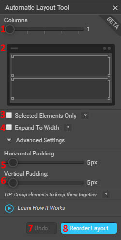
Figure 31: Automatic layout tool
- Choose the number of columns for your layout.
- This is a preview of how your elements will be laid out when you submit the tool.
- This allows you to decide if everything will be changed when you hit submit, or just certain elements.
- You can choose to expand elements so that the columns combined fit the width of your webpage.
- Choose the horizontal padding between elements.
- Choose the vertical padding between elements.
- Undo the layout change.
- Submit the layout change.
Summary
Overall, Webydo is sort of like the Photoshop of website design. You can individually manipulate various elements to create any style you want, and none of it requires the use of any HTML or CSS coding. You can do just about anything through this website editor. However, the cost is substantial, and a lot of people won’t need all of the features that Webydo offers. The vast multitude of customisation options also results in an interface that is less intuitive than other website builders. However, if you want to create a website with excellent precision, Webydo is a great choice.
Webydo also has a wide variety of support options if you want more help. You can use tutorials at their knowledge base located at http://knowledgebase.webydo.com/, or video tutorials located at http://www.webydo.com/video-tutorials.html. You can submit a contact form at http://www.webydo.com/contact-support.html, or you can use the chat box located in the web page editor to talk to a support staff member at any time. Finally, you can discuss problems on the community forum located at http://forum.webydo.com/.